Infographic Website:
Design in Toronto
PROBLEM: Lack of data on the design community in Toronto and Ontario. Visualizing data for the industry professional.
This website design features a side-scrolling sprawl of a series of info-graphics revealing trends in the design climate of Toronto (at the time of 2017) for the purposes of providing new creative graduates with data comparing design disciplines, job titles, with other cities in Canada, along with other stats to help inform their next steps.
What began as a curiosity fuelled this student-just for-fun project where I played detective to visualize various data in a to-scale side scrolling gimmick to match Toronto neighbourhoods from West to East.
Ground research


I began with some preliminary research on companies, organizations, firms, boutique studios in Toronto that I knew were practicing.
As my list grew, I dabbled with ways to classify my information, and continued to conduct direct research and find existing documentation on design facts and vocational stats

I played with the architecture of the information and ended up with way more data than I bargained for. I couldn't wait to share it, so my project expanded from a few infographics into a series


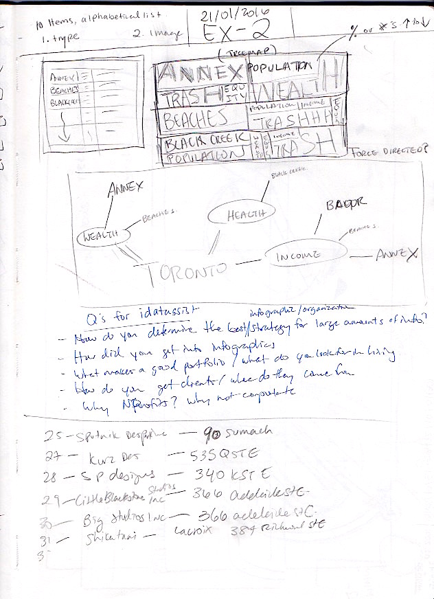
Mapping out my problems

I made more connections and devised a way to create a narrative with the information. A challenge that I had was how to structure the large amounts of research and data I gathered directly and indirectly. The more I found, the larger the visual system had to be as I wanted to share as much ofthe new data that I could.


I tested out ways to visualize the information in a way that would allow the viewer to draw conclusions on their own. I began writing copy to go with the story.

Here I am trying to come up with an icon and image system to tie the story together, a visual language in a way.

More data visualization techniques. Are explored.

How can the viewer be guided through an experience, a story, and also make connections? Working with the image of an urban environment, could we visualize the city through data? Horizontal scrolling can represent Toronto from East to West. I also came up with a colour coded system for my information.
Visualization and data


Final site (currently unavailable for use)
